


Bianca Levan
Hand-cut Paper Art
BRANDING + PRINT DESIGN + WEB DESIGN
Bianca is a visual artist based in San Francisco, specializing in the intricate and delicate art of paper-cutting. Transitioning from a corporate career to pursue her artistic passion, Bianca has established her own studio, gaining recognition from both local and national galleries for her unique artistic practice.
Bianca reached out to me to work on her new branding and an engaging website that would serve as a comprehensive digital portfolio. Additionally, the design extended to digital and print materials to enhance Bianca's representation in galleries, ensuring a consistent and captivating showcase of her unique paper-cutting art across various mediums.

Moodboard photos: Usplash, Bianca Levan, Takumi Documentary
Moodboard
This moodboard tells the story of the artist who is guiding us through the artistic process. She is a storyteller, she reveals the world of the unconscious and explains the symbolics. The work creates a visual map and stays in the focus. We need to dedicate the time and let ourselves to immerse in the process and follow the emotions in order to understand.
The photography shows the artistic gesture and the artistic choices. The artist follows intuition supported by a strong foundation of design principles. The atmosphere is created with images showing black papercuts, paper texture and its subtle glow as the artwork appears in the process. The artist’s studio filled with light.
Colour Palette
The colour palette is composed of Light Metropolitan, serving as a neutral coulour, recalling the natural paper tones. Primary colour is Old Paper, which blend together with the skin tones to show the bodily aspect of the creations. This combination aims to build a warm and welcoming atmosphere, avoiding popular white backdrops for the artistic portfolios. Instead of quite cold and flat black in the colour palette is a warm dark charcoal, referring to a drawing charcoal, Bianca uses to sketch. It is invariably dark gray to black. Black paper of Bianca’s works, is never truly black as well, when we look at it.


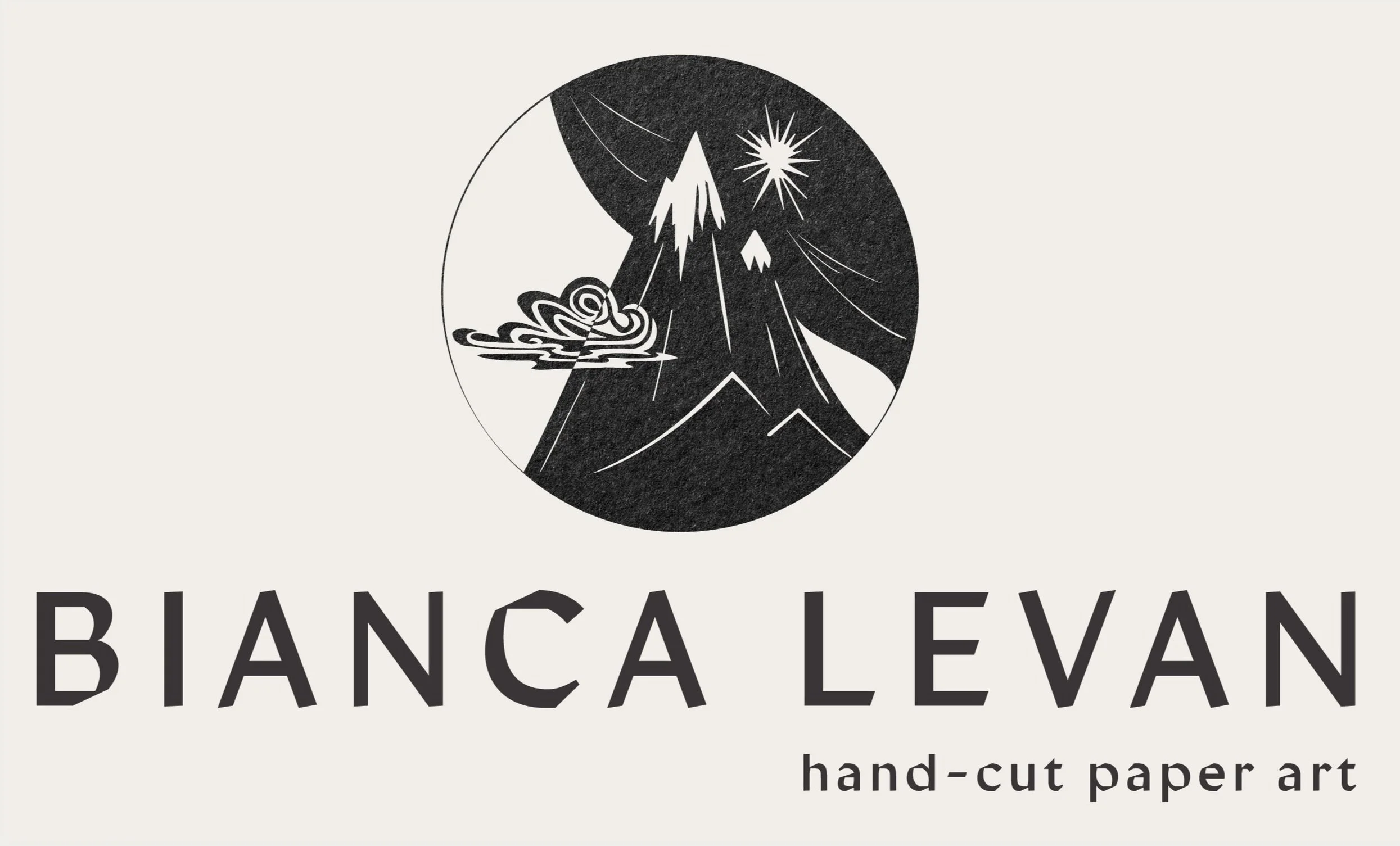
LOGO
Bianca`s logo is constructed on her artwork elements to give an instant feeling of the style and connect us with her artistic world. The mountain is a important motif in Bianca’s world, of a strong symbolism.
There is dualism incorporated in the logo to show the day and night and cycles of life that Bianca shows in her works.
Next to main stacked logo, there is a horizontal version with the logo icon on the left and a submark with artist’s initials and an oak twig with leaves, also taken from Bianca endeavour.


Typography


Print Design


Website designed with new branding, comprised of 7 pages with the main focus on Bianca’s reach portfolio presentation, events and large About page. The individual works in portfolio are also linked to the shop, if they are available for sale.
You can visit Bianca’s website and see my branding application here.
WEB design


Other BRANDING PROJECtS

New branding for Amanda Joy Photography

Branding for Körperkultur - a social club for women

Branding for nutritionist Tessa Holi