
Amanda Joy Photography
BRANDING + WEBSITE STYLE + PRINT & DIGITAL DESIGN
Amanda Joy is a family photographer who creates vibrant, heartfelt portraits that capture the laughter, connection, and joy of family life. As her business flourished and began attracting a steady stream of clients, Amanda was ready to evolve beyond her existing visual identity and embrace a fully custom, cohesive brand.
The rebrand was designed to connect with expat families seeking a joyful and memorable photography experience in the picturesque Swiss Alps and charming Swiss cities. The goal was to evoke a sense of authenticity, warmth, and the magic of being together.

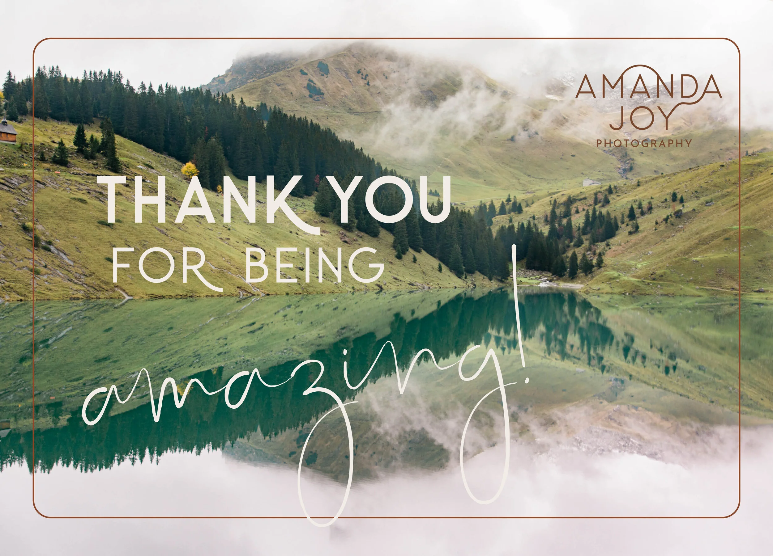
LOGO
The arch line in the logo stands for stunning landscape of Switzerland, with its beautiful mountains and mesmerising lakes. It comes in alternatives with name only and two types of seals with the name and the tagline and favicon. It is important to give the logo enough free space around. The space around equals to the size of a logo font, and is 3 times larger than singular distances between the logo text lines.

Colour Palette
Shades of blue play an important role and evoke feeling of authenticity and reliability. Alpine Forest and Moss complement cool feeling of blue hues and bring warmth of nature and of alpine experience. Chocolate is an accent colour, associated with a joyful experience of what we associate with Swissness. This versatile colour palette creates warm and welcoming atmosphere.

Typography
Carrol is a classic and modern sans serif font with alternates up to 3 in each kind. It enables to create clear, but fun headlines , that draw attention and create warm and joyful atmosphere. Supported by Just Sunday script as an accent font to contrast the sans serif and enhance emotional messages. Body copy in Baskerville font brings a sophisticated mood in and room “to rest and contemplate”.

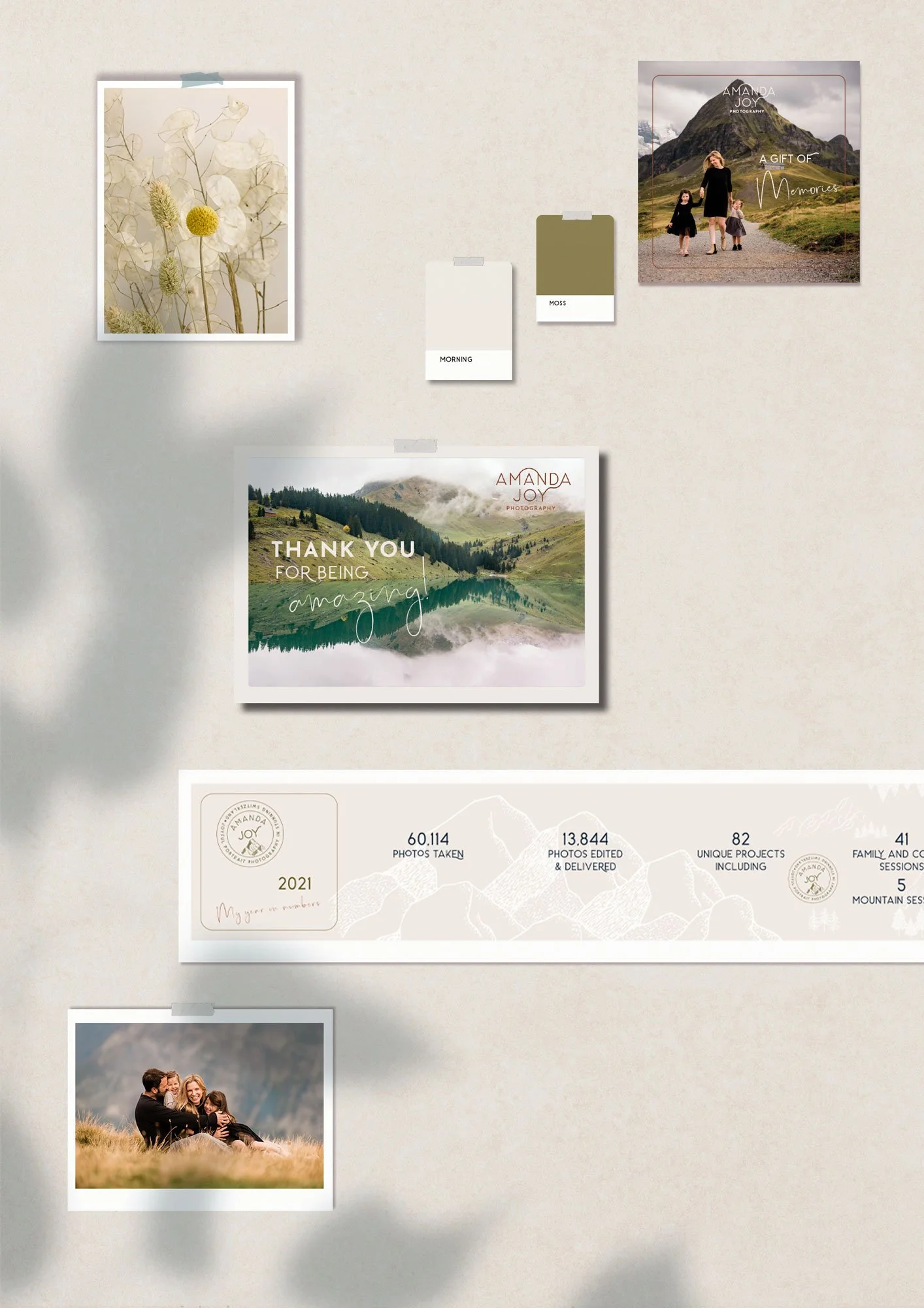
Print Design
STATIONERY
Business cards in 5 brand colours and letterhead in Morning colour with a frame that appears on business cards and collaterals.
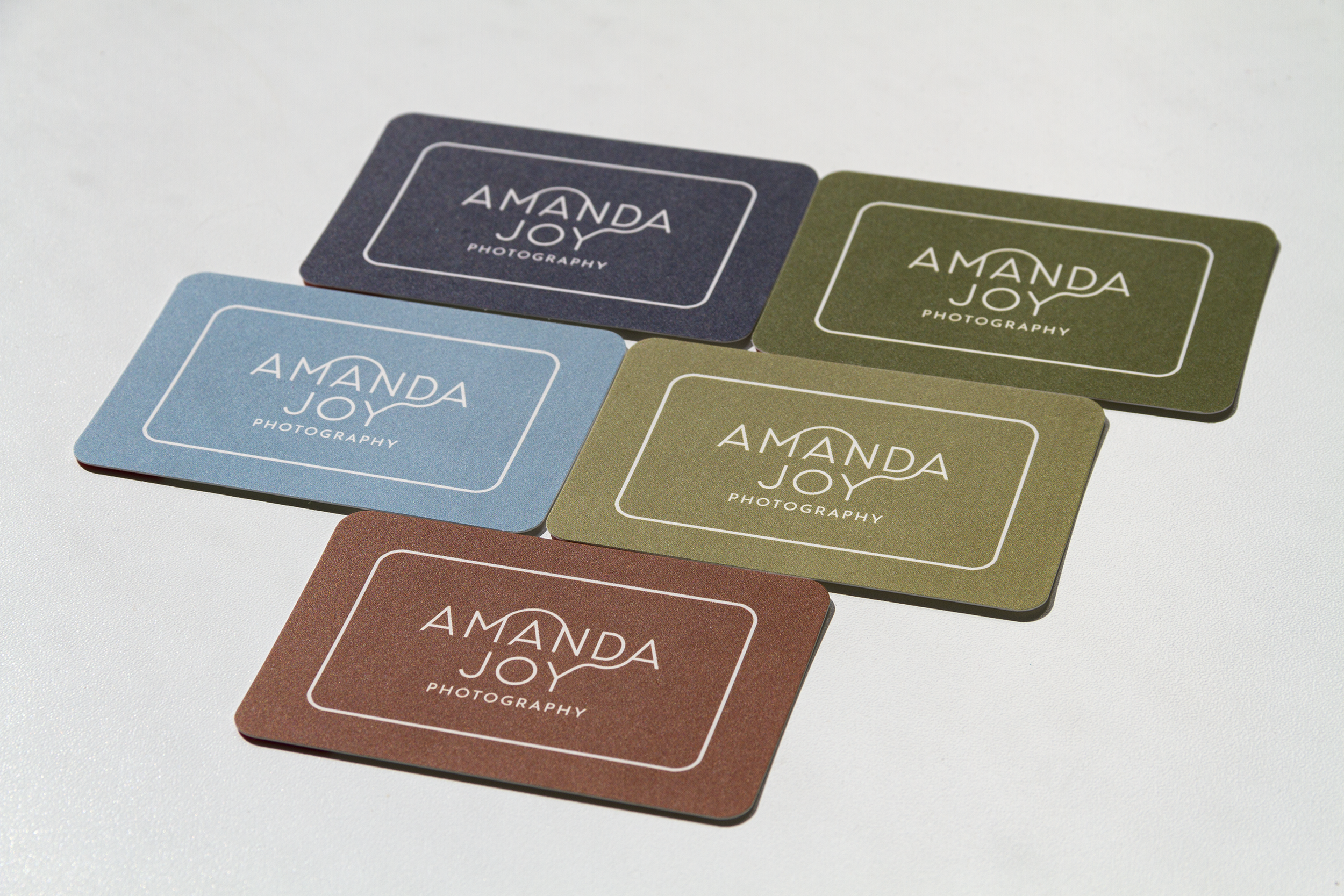
BUSINESS CARDS
Cards with rounded edges, designed in 5 brand colours with logo displayed in the Morning Sky colour. Printed on naturally texured Cotton paper (298gsm) with uncoated finish. The paper is made from 100% recycled T-shirt offcuts, so it is ecological and tree-free.

WELCOME KIT
Printed media that are first welcome to the clients . The kit consists of the Welcome Card, the Preparation and Style Guide in a form of magazine and the Product Guide, all printed in A5 size. The prints are packed into a cardboard mailer, in the branding Haze blue colour with the logo and illustration of the mountains in the Morning colour.


PREPARATION & STYLE GUIDE

THANK YOU SET
Box and tissue to wrap the photo album, certificate for little ones for being heroes during photo sessions, thank you cards. All printed on environmental friendly materials.

Website Style
Website reflects the branding principles with the colour palette complementing Amanda’s photography.
Please have a look: www.amandajoy-photography.com.

My new branding by Iza is loaded with all the things I love, earth tones, simplicity, vibrancy and sophistication with a little bit of playfulness to top it off. I was so blown away at how much she was able to pull from personality and body of work to create a brand that captures me so perfectly. I now present my business with more confidence than ever before, knowing that my branding is truly aligned with my message.
Since my rebranding my booking conversations have increased by 400%.
Iza is just awesome to work with and the final results are nothing short of *chef’s kisses!*
10/10! 5 stars! Highly recommend!
Amanda

Colour palette in branding for Katie Lane Interiors

Water bottle label in branding for Anna Chaplin Fitness

Newsletter in branding for Körperkultur

Stationery in branding for Transfer